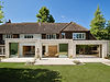
A stepped brick extension that brings clarity and cohesion through proportion, rhythm and spatial flow.
Guildford, Surrey

Located in Guildford, this project is a comprehensive reconfiguration and extension of an existing home that previously lacked coherence in its spatial arrangement and architectural expression. The brief called for a complete review of the ground floor and a large rear extension that would unify the property, rationalise circulation and create a series of well-connected family spaces. The concept of three stepped bays emerged early in the design process, derived directly from the geometry and character of the existing building.


The house was originally composed of three distinct parts: two symmetrical wings and a fragmented central section. Its façades combined three principal materials — brick, tile and timber — arranged inconsistently across the elevations. Rather than compete with this complexity, the new design distils it into a legible architectural idea. The extension is formed from three brick bays of varying widths, stepping both horizontally and vertically to create a dynamic façade that reflects the building’s inherent character while clearly expressing a contemporary addition.
A rule of diminishing proportions anchors the composition. The largest bay sits to the east, the smallest to the west, establishing a subtle gradient across the elevation. This ordering is intentionally juxtaposed with the detailing of the façade: the smallest bay incorporates the deepest glazed reveals and most pronounced brick steps, while the largest is more restrained. This inversion gives the façade visual drama and creates shifting shadow lines throughout the day, animating the exterior and emphasising the depth of the geometry.


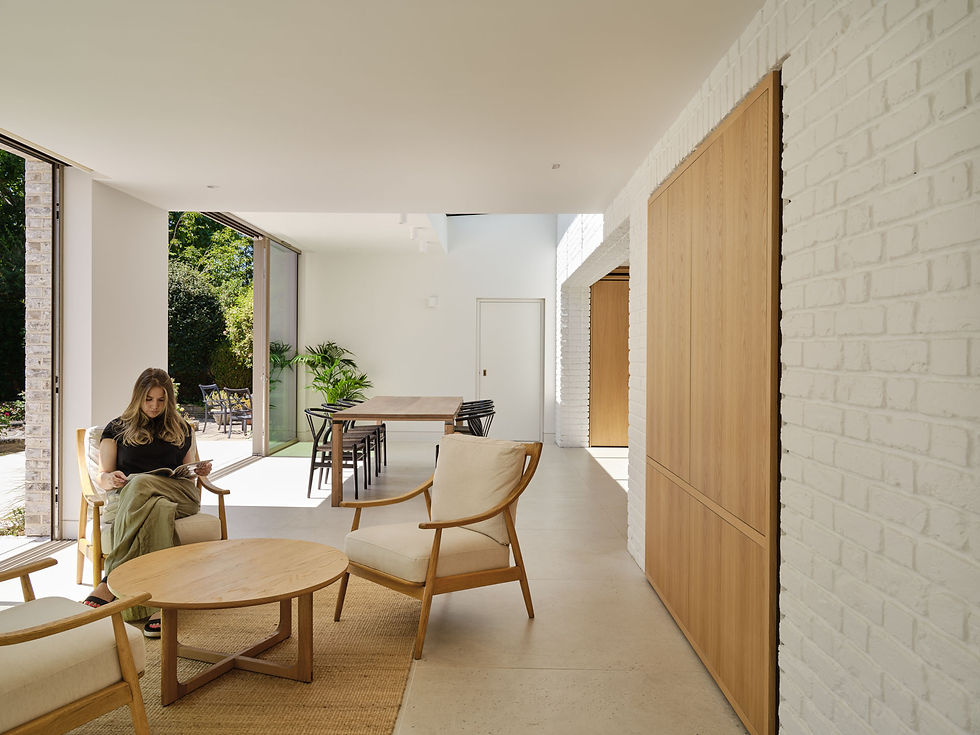
The stepped language continues internally, shaping the plan and providing continuity between inside and out. Each bay defines a key ground floor space. Two bays accommodate the main living functions — kitchen, dining and sitting — while the third forms a quieter snug connected to the heart of the home. Repositioning the kitchen at the centre has transformed the flow of the house, allowing every room to relate more naturally to one another and to the garden beyond.

Materiality is kept intentionally simple to reinforce clarity. A pared-back palette of brick, light finishes and a painted white brick spine wall ties the interior spaces together while allowing the stepped geometry to remain the dominant architectural feature. Large openings in each bay maximise light and frame views, with the most generous glazing placed within the smallest bay to create contrast and reinforce the design hierarchy.
Our project Three Bays demonstrates how a single well-defined architectural idea can bring cohesion to a previously disjointed home. By drawing from the existing structure while introducing a contemporary interpretation, the project creates a unified and characterful extension that celebrates proportion, material and spatial flow. The result is a home with a strong identity, grounded in its past yet confidently reimagined for modern living.
